At the beginning of each year, Pantone proclaims the color of the year – from Very Peri to Ultimate Gray to Living Coral–the moment is a celebration of hues, down to the nitty-gritty HEX codes.
But it was the aftermath that was perhaps most telling. This year, many companies and influencers jumped on the Viva Magenta trend (the official color for 2023), incorporating it into their branding, products, and content. And don’t even get us started on home decor trends.
But you might be wondering what all the commotion is about. Isn’t magenta just a fancy way of saying “maroon?” Do the nuances of color really matter THAT much?
As it turns out, nuances matter. Especially when it comes to marketing.

Simple changes to how you add color to a header or CTA button can change your conversion rates in ways you would never expect.
The Importance of Color in Marketing
Research has shown that color can influence our perceptions of a brand, affect our mood, and even influence our purchasing decisions. Instinctually, you know this to be true. Think about famous brands that have become a color all in themselves:
- Tiffany Blue
- Coca-Cola Red
- UPS Brown
- John Deere Green
- Home Depot Orange
- Hershey’s Brown
- Gatorade Orange
Sure, you might not see these colors in your crayon box, but you know exactly what these colors look like. What does this prove? Color is powerful and can help make your brand more recognizable in a crowded market. Talk about brand recognition!
So how can you apply this to your own marketing? With psychology, of course.
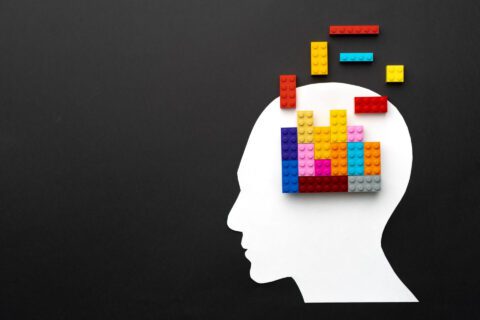
The Psychology of Color
Different colors can create different emotions and reactions in the eyes of the viewer. Understanding how this works can help you use color more effectively in your marketing campaigns.
Here are some of the most common associations with different colors:
- Red: Red is associated with passion, excitement, and energy. The color has been shown to increase heart rates. So when you want to signify romance or inspire quick decisions, red is your go-to.
Keep in mind, though, that red is also the color of red lights and stop signs – for this reason, it is great to get attention but terrible for CTA buttons. - Blue: Blue is associated with trust, reliability, and security–and unlike red, it has been shown to reduce heart rate. You will often see it associated with business, healthcare, and technology. Dove, American Express, and IBM are a few brands that effectively use the color blue–not to mention Facebook, Twitter, and LinkedIn.
- Green: Green is a very popular color choice for branding, perhaps partly because it is extremely popular across different cultures and ages. It also has been shown to inspire creativity. Studies find that green generates more creative ideas (say, for example, sitting in a green room) than other colors.
Green also evokes feelings of harmony and balance. Starbucks, The Body Shop, and Whole Foods use green to invoke a sense of wellness, wholeness, and that “down-to-earth” vibe. - Yellow: Yellow is associated with optimism, happiness, and warmth. It can also evoke feelings of caution and warning. Yellow is often used in marketing children’s products and food marketing–look no further than the Golden Arches of the one and only McDonald’s.
- Purple: Purple is associated with luxury, sophistication, and creativity. It can also evoke feelings of royalty and spirituality. Purple is often used in marketing for high-end products and services. One example we can think of is Cadbury Chocolates, with its iconic purple packaging.
- Orange: Orange is associated with energy, excitement, and enthusiasm. You’ll find a lot of orange in food and beverage marketing (we’re looking at you, Fanta), as well as in sports and entertainment marketing (Harley-Davidson, and Nickelodeon, to name just two).
- Pink: Pink is associated with femininity, love, and nurturing. It can also evoke feelings of sweetness and innocence. Pink is often used in marketing for products aimed at women. Think of Barbie’s pink Corvette or Victoria’s Secret’s packaging.
- Black: Black is associated with sophistication, elegance, and power. It can also evoke feelings of mystery and intrigue. Black is often used in high-end fashion and luxury product marketing. Think Chanel and Mercedes-Benz.
How to Pick Colors for Your Brand Like a Boss
So we’ve talked about colors and psychology… but how can you apply all of this to your own marketing. Here’s how to pick colors that will make your brand stand out and connect with your audience.

Get to Know Your Brand’s Personality
Before you start picking colors, think about what your brand stands for. Is it fun and playful, or serious and sophisticated? Once you have a clear picture of your brand’s personality, you can pick colors that reflect it.
Know Your Audience
Your audience is the most important part of your brand. You want to make sure that the colors you choose resonate with them. Think about who your target audience is, what they like, and what their values are. For example, if your target audience is kids, you might want to use bright primary colors.
Consider Your Industry
Different industries have different color schemes that consumers associate with them. For example, the fast-food industry often uses red and yellow to create a sense of speed and urgency. So, consider your industry when choosing your colors.
Test and Iterate
Once you have a list of colors that you think will work for your brand, it’s time to test them out. Use A/B testing to see which colors resonate with your audience the most. You might be surprised at the results!
Where do we go from here?
The impact of color can not be underestimated when it comes to your marketing and branding. It can influence people’s perceptions, emotions, and purchasing decisions. Understanding the psychology of color and its associations with different emotions can help you use it more effectively in your marketing campaigns. By choosing colors that reflect your brand’s personality, resonate with your audience, and align with your industry, you can make your brand more recognizable and stand out in a crowded market. Don’t be afraid to test and iterate to find the right colors that will help you achieve your marketing goals. With the right use of color, you can make a lasting impression and drive conversions in ways you may not have even expected.
Have these marketing campaigns inspired you to ramp up your own marketing game? If you need help figuring out where to start or where to put your energy when it comes to marketing, this free quiz can help.