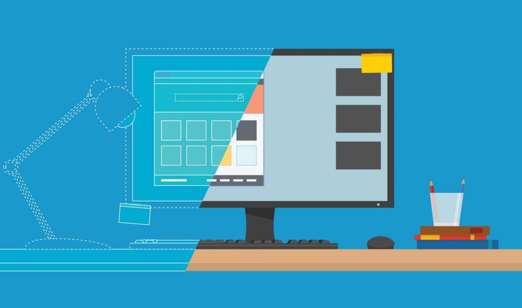
You only have one chance at making a first impression. And when it comes to your home page, you better make sure that first impression is a good one; otherwise, you not only risk leaving money on the table, you risk coming across as that dreaded “U” word.
Unprofessional.
The bad news? You have 50 milliseconds to make a good impression. The good news? It isn’t that hard to create a well-designed website.
Whatever you do, avoid these bad website design mistakes like the plague (unless you want to increase your bounce rate, that is!).
Lack of clarity on the Home Page.
When people visit your website, they should know what your company does in a second. No, not a second, actually, a MOMENT. That’s how long you have to convince them that they should stay and not go over to your competitor.
Make sure that somewhere on your main page, there is something that declares in plain (clever doesn’t hurt either if you can manage it) terms exactly who you are and what you do. Don’t make ‘em have to go to the “About Us” page to figure this stuff out, folks.
Too much text.
While you want to be clear about what you do, there is such a thing as overexplaining. So much of a website experience is visual, and that sort of first impression happens in an instant. Especially in a digital age where mobile usability is more important than ever, you need to not overwhelm your viewer with too much text. How much is too much? If someone visits your website and mistakes it for an epic Babylonian saga, then you probably have too much text (and don’t even get us started on typos!).
If you want to go deeper into this question, check out our blog on the ideal length for website content.
Too many graphics in conflicting colors.

Maybe you are a great photographer. Or perhaps you hired a great photographer. Either way, you have an entire arsenal of images you want to use, so why not use them all?! After all, you don’t want all that work going to waste. And isn’t an image worth 1000 words and all that jazz?
Don’t. Just DON’T.
An image might be worth 1000 words. That’s why, a lot of times, one image is enough! Be strategic in your use of graphics. Give your viewer something to focus on. Embrace white space. Remember, there’s beauty in simplicity. Take it straight from Tesla if you need inspiration.
Too many (or dead) links.
Perhaps you have twenty different services you need to explain. Maybe you have twenty different qualifications, twenty different locations, and twenty different versions of your product. While it might be tempting to place these all in colorful hyperlinks on your website, like a glowing Internet version of an Encyclopedia all about you, you must RESIST.
Links are powerful things. Use them strategically to improve user experience. Otherwise, you’ll risk looking like Craigslist. Only Craigslist can get away with looking like Craigslist.
Confusing CTAs.
There are so many mistakes you can make with your “call to action.” And don’t even get us started on shopping cart abandonment (check out how to do “Buy Now” buttons the RIGHT way here).
If there are fifty possible actions your customer can take next, things can get a bit confusing. It is better to simplify what you want them to do next down to the most important things and make those things crystal clear. Don’t be scared to play with the way you WORD your call to action. But make sure your call-to-action isn’t causing your potential customers’ heads to spin in confusion.
Boring design.
Leave boring to being stuck on hold or waiting in line at the grocery store. Your website should be far from boring. This doesn’t mean stuffed with information and dancing images, by the way. Even simple websites can be far from boring.
The key here is to have a color scheme, design elements, and a focal point that sparks curiosity and speaks to your brand image. One that inspires interaction and explains exactly what to do next. Not sure what we mean? Check out the SizzleForce home page for an example of an eye-catching focal point (yes, he is an elephant, and his name is Elvis, in case you were wondering).
Pixelated images.
Pixelated images are only cool when they are intentional. If they are NOT intentional, they mean death to a website. They are the Internet visual equivalent of nails scratching a chalkboard.
Avoid pixelated images at all costs. It is better to show NOTHING than to show a pixelated image.
Overwhelmed by all of this? Need help?
Not sure if your website is making a good first impression? We’re here to help! Schedule a call to talk to us about what steps you’d like to take to grow your business!
If you’re not even sure where to start we’ve also got this nifty quiz that will help you determine how you can improve your marketing strategy!